Oases Launches New Interface
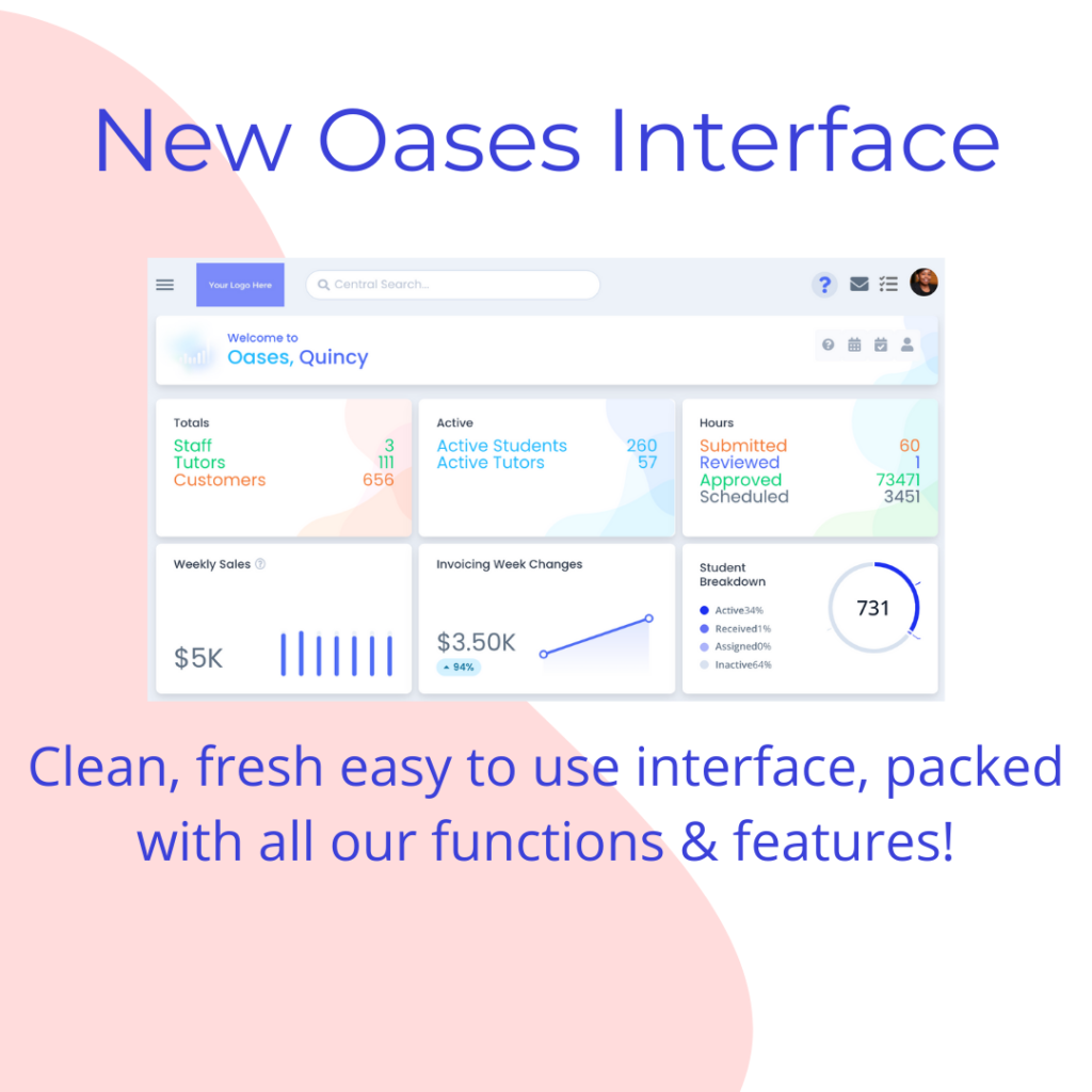
The new Oases Interface is now live for current and new customers. Furthermore, we are proud to announce that all of the Oases features and functions you have come to expect are still there in the new interface. However, we have programmed a clean, fresh and modern user experience and display of your important data.
Additionally, we have added some key changes we have added in the new interface include:
- Display your logo on the screen
- Auto Save of edits
- Cleaner Program & Location Filtering
- Updated customer facing documents and reports
But most importantly in the new Oases interface, to keep your experience uncluttered and clean we are not always displaying the tools you are not using. Therefore, the screen stays clean until you ask to perform a function. However, if you do use a filtering tool, for example, Oases remembers it until you log out or clear it away. That is to say, we have spent a lot of time, saving you time.
The Tutor interface is separate and may be viewed here.
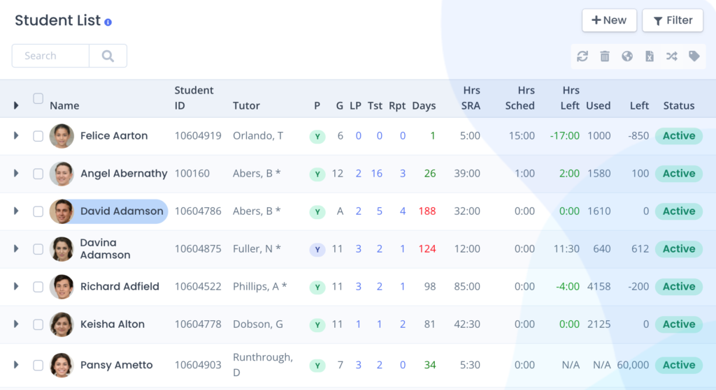
Student List in New Oases Interface
The graphic below shows the student list on the new interface, set to show basic information with the filter area closed. Most importantly, you can flip the view to show contact details or expanded to show monthly hours.
View The New Oases Interface
Our existing customers can switch to the new interface and explore the new look and navigation. However, if you are not an Oases customer and you would like to see the features and functions of Oases in the new interface, you have several options.
For example, all of the graphics and videos on our website have been updated or you can book a demonstration using the link below.
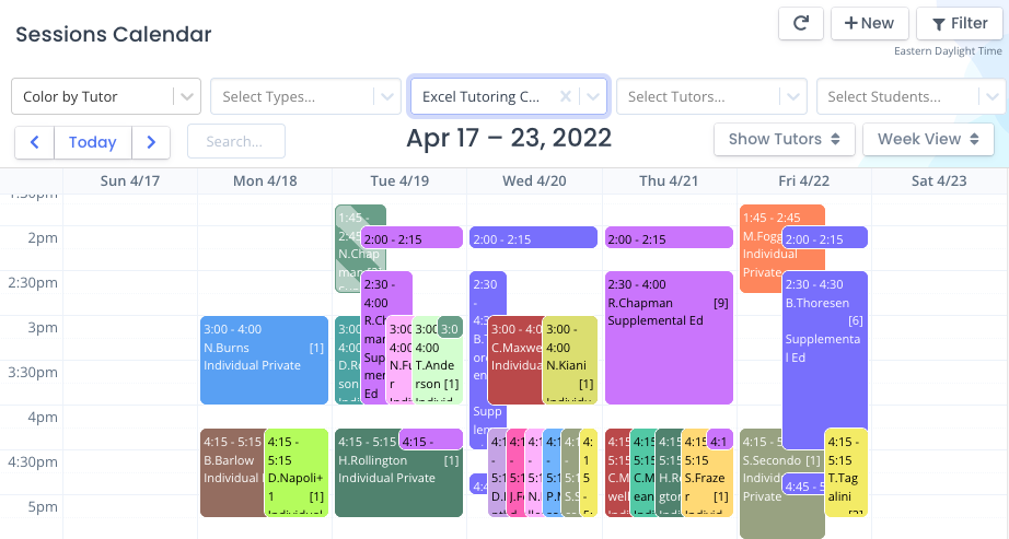
The graphic below shows the Central Calendar from the new interface. For example, the filters are open and filtered to all of the sessions in a single program.
Interested in Oases for your Tutoring Business?
Love it and want it now?
Create your Oases database!


